Problem
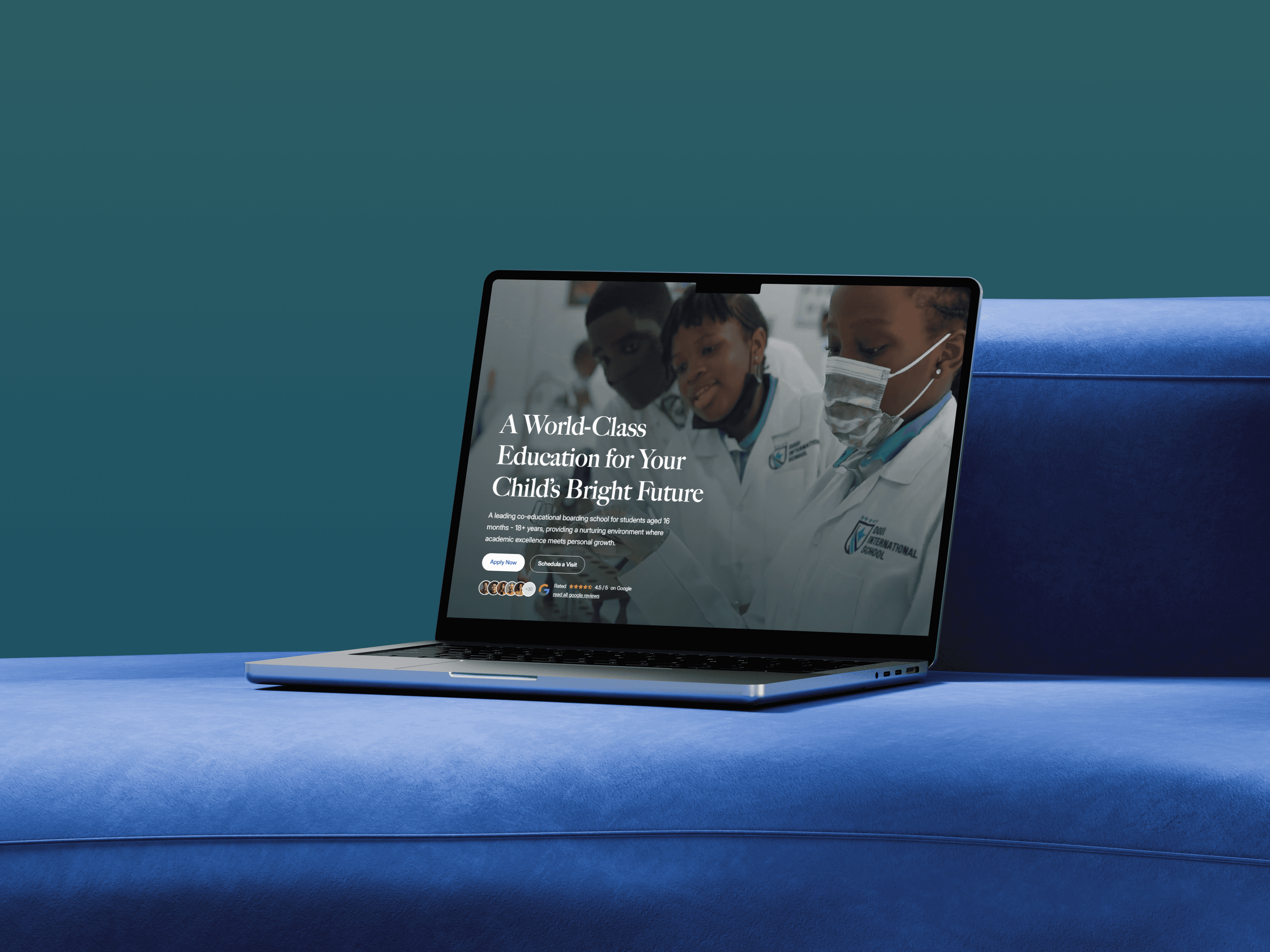
The old site felt static and made admissions unclear. Staff relied on developers for routine updates to news, events, and jobs. The school needed a modern, mobile-first site that shows programs clearly, builds trust with testimonials, and guides families through admissions.
Solution
Information architecture with top-level sections: About, Academics, Student Life, Admissions, News and Events, Contact Homepage with hero message, clear Apply and Visit actions, program pathway cards, school metrics, and testimonial highlights Academics with four program pages using consistent templates, imagery, and supportive copy Admissions with a six-step timeline (apply, fee note, review, assessment and interview, decision, documentation, orientation) and clear CTAs Tuition and program tabs with concise bullet points and term fees where applicable Student Life with galleries, stories, and co-curricular highlights Testimonials presented as video cards for parents and teachers CMS collections for events, news, and careers so staff can publish without developer help Interaction and motion using subtle scroll reveals, controlled parallax, timeline highlights, and accessible focus states Design system with a tight spacing scale, consistent card anatomy, section dividers, and responsive typography

Outcome
Families can understand programs quickly and follow a clear admissions path from interest to orientation Admissions and admin teams publish events, news, and job openings directly in the CMS, reducing content bottlenecks Program tabs, tuition info, and testimonials build trust and reduce back-and-forth questions The site feels faster and more polished on mobile, with consistent spacing, alignment, and interaction patterns that support a professional brand presentation